Key Takeaways
- Curtain color has a major impact on a room’s mood, visual balance, and overall design style.
- Choosing colors that coordinate with walls, furniture, and decor creates a cohesive and polished appearance.
- Neutral curtain colors offer flexibility, timeless appeal, and compatibility with a wide range of interior styles.
- Light-colored curtains can make rooms feel larger and brighter, while darker shades add depth and drama.
- Natural lighting affects how curtain colors appear, making fabric samples an important part of the selection process.
- Fabric texture, patterns, and seasonal needs should be considered alongside color when choosing window treatments.
- Thoughtful curtain selection can improve both the aesthetic appeal and comfort of a living space.
Curtains do much more than cover windows. They help control light, improve privacy, add texture, and influence the overall look and feel of a room. Choosing the right curtain color can tie an entire design together, while the wrong choice can make a space feel disconnected or unbalanced.
Many homeowners focus on furniture, wall paint, and flooring when decorating, but curtains often have a significant visual impact because they occupy a large portion of the wall. The color you choose can make a room feel larger, cozier, brighter, more elegant, or more modern.
The good news is that selecting the right curtain color does not require professional design experience. By understanding a few basic design principles and considering your existing decor, you can confidently choose curtains that complement your home and enhance each room’s appearance.
This guide explores practical tips for selecting curtain colors that work well with your home’s style, color palette, and functional needs.
Why Curtain Color Matters
Curtains are often one of the largest decorative elements in a room.
Because of their size, they can:
- Draw attention
- Blend into the background
- Create contrast
- Add warmth
- Influence mood
The right color helps create a cohesive design that feels intentional and balanced.
Curtains can either serve as a subtle supporting feature or a bold statement piece.
Start With Your Existing Color Palette
Before shopping for curtains, evaluate the colors already present in the room.
Look at:
- Wall colors
- Furniture
- Rugs
- Artwork
- Decorative accessories
The goal is to create harmony rather than introduce a color that clashes with existing elements.
A good curtain color should feel connected to the room’s overall design.
Decide Whether Curtains Should Blend or Stand Out
One of the first design decisions involves determining whether you want the curtains to blend in or become a focal point.
Curtains That Blend In
Matching curtains to wall colors creates:
- A seamless look
- A larger visual appearance
- A calm atmosphere
This approach works especially well in:
- Small rooms
- Minimalist spaces
- Modern interiors
Curtains That Stand Out
Contrasting colors create:
- Visual interest
- Drama
- Personality
Bold curtain colors can become a room’s defining feature.
Both approaches can be successful depending on the desired effect.
Consider the Room’s Purpose
Different rooms may benefit from different curtain colors.
Living Rooms
Living rooms often work well with:
- Neutrals
- Soft earth tones
- Elegant accent colors
Bedrooms
Bedrooms typically benefit from:
- Calming shades
- Soft blues
- Greens
- Warm neutrals
Home Offices
Home offices may benefit from:
- Focus-enhancing colors
- Subtle neutrals
- Muted greens
The room’s purpose should influence color selection.
Neutral Curtain Colors: A Safe and Versatile Choice
Neutral curtains remain popular because they complement a wide variety of styles.
Popular neutral options include:
- White
- Ivory
- Beige
- Taupe
- Gray
- Greige
Benefits of Neutral Curtains
They:
- Work with changing decor
- Create timeless appeal
- Feel clean and sophisticated
Neutral curtains rarely go out of style.
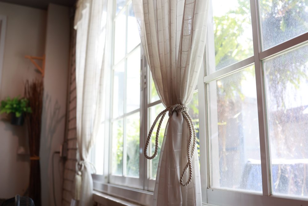
White Curtains for Brightness
White curtains can make rooms feel:
- Larger
- Brighter
- More open
They pair well with:
- Modern decor
- Coastal styles
- Farmhouse interiors
However, white fabrics may require more frequent cleaning.
Gray Curtains for Modern Appeal
Gray remains one of the most versatile curtain colors.
Benefits include:
- Modern appearance
- Wide compatibility
- Various shade options
Light gray creates softness, while darker gray adds sophistication.
Gray works well in both contemporary and traditional spaces.
Beige and Taupe for Warmth
Beige and taupe curtains provide warmth without overwhelming a room.
These colors complement:
- Wood furniture
- Earth-tone palettes
- Traditional decor
They create a comfortable and welcoming atmosphere.
Matching Curtains to Wall Colors
Many homeowners wonder whether curtains should match wall colors.
The answer depends on the desired look.
Similar Shades
Choosing a curtain color within the same family as the wall color creates cohesion.
Examples:
- Light gray walls with charcoal curtains
- Beige walls with taupe curtains
Exact Matches
Exact matching can work but may sometimes feel flat.
Slight variation often adds more depth.
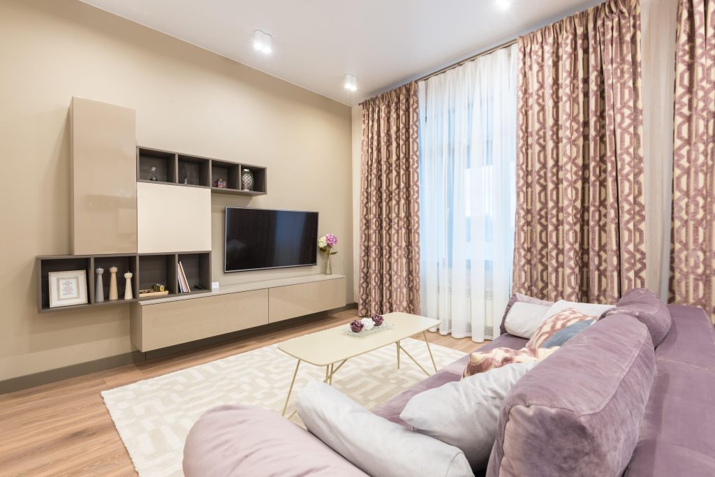
Coordinating With Furniture
Furniture can provide excellent inspiration for curtain colors.
Consider matching curtains with:
- Sofas
- Accent chairs
- Bedding
- Upholstery
Repeating colors throughout a room creates visual consistency.
This approach often results in a polished appearance.
Using Accent Colors
Curtains can reinforce accent colors already present in the room.
Examples include:
- Navy blue
- Forest green
- Burgundy
- Mustard yellow
Using existing accent colors helps maintain balance.
Avoid introducing too many competing colors.
Dark Curtains vs. Light Curtains
Both options offer advantages.
Light Curtains
Benefits:
- Reflect light
- Create openness
- Enhance brightness
Dark Curtains
Benefits:
- Add drama
- Create contrast
- Improve light blocking
Consider the amount of natural light available in the room.
Understanding Color Psychology
Colors influence how spaces feel.
Blue
Associated with:
- Calmness
- Relaxation
- Serenity
Green
Associated with:
- Nature
- Balance
- Freshness
Gray
Associated with:
- Sophistication
- Neutrality
Beige
Associated with:
- Warmth
- Comfort
Choosing colors that support the room’s purpose can improve the overall atmosphere.
Consider Natural Lighting
Natural light affects how curtain colors appear.
Rooms with abundant sunlight often make colors look brighter.
Darker rooms may benefit from lighter curtain colors that help reflect available light.
Always test fabric samples under different lighting conditions before making a final decision.
Patterned Curtains vs. Solid Colors
Color selection also depends on whether curtains are patterned or solid.
Solid Curtains
Advantages include:
- Timeless appearance
- Flexibility
- Simplicity
Patterned Curtains
Advantages include:
- Visual interest
- Personality
- Decorative impact
If the room already contains many patterns, solid curtains may provide balance.
Using Curtains to Make a Room Feel Larger
Curtains can influence perceived room size.
To create a larger appearance:
- Choose light colors
- Install curtains higher
- Extend rods beyond window frames
Light-colored curtains often make spaces feel more open.
Creating Cozy Spaces With Color
Warmer curtain colors can make rooms feel inviting.
Popular cozy shades include:
- Warm beige
- Soft brown
- Rust
- Deep green
These colors help create comfortable environments for relaxation.
Seasonal Considerations
Some homeowners enjoy updating decor seasonally.
Lighter curtain colors often feel appropriate during:
- Spring
- Summer
Richer tones may feel more inviting during:
- Fall
- Winter
Layering curtains can provide flexibility throughout the year.
Energy Efficiency and Curtain Color
Curtain color can affect heat absorption.
Light Colors
Reflect more sunlight.
Dark Colors
Absorb more heat.
In some climates, curtain color can contribute to indoor comfort and energy efficiency.
Curtains and Winter Comfort
Heavier curtain fabrics can play a role in improving home comfort during winter by helping reduce drafts and heat loss around windows. Pairing insulated curtains with complementary colors allows homeowners to enhance both comfort and style at the same time.
Function and appearance often work best when considered together.
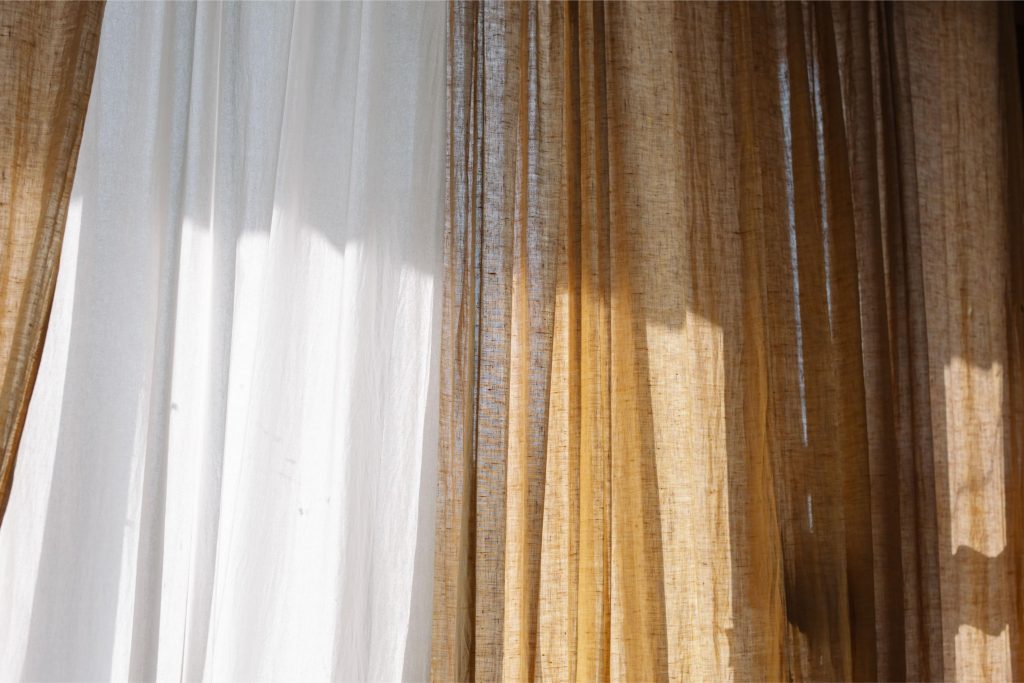
Consider Fabric Texture
Texture influences how colors appear.
Examples include:
- Linen
- Velvet
- Cotton
- Silk blends
The same color can look very different depending on fabric texture.
Always evaluate color and material together.
Test Samples Before Buying
Fabric samples help prevent costly mistakes.
View samples:
- During daylight
- At night
- Near furniture
- Against wall colors
Colors can look dramatically different depending on lighting conditions.
Testing first often leads to better decisions.
Coordinate Throughout the Home
While every room does not need identical curtains, maintaining some consistency helps create flow.
Examples include:
- Similar color families
- Matching hardware
- Coordinated fabrics
A cohesive approach can make the entire home feel more intentional.
Curtains During Renovation Projects
Window treatments are often overlooked during remodeling.
Homeowners researching how to prepare for home upgrades should include curtains in their design planning process. Selecting colors early helps ensure that wall paint, flooring, furniture, and window treatments work together cohesively once the project is complete.
Early planning often prevents expensive redesigns later.
Common Curtain Color Mistakes
Ignoring Existing Decor
Curtains should complement the room rather than compete with it.
Choosing Trends Over Longevity
Very trendy colors may feel outdated quickly.
Forgetting Lighting Conditions
Lighting dramatically affects color appearance.
Selecting Colors Without Samples
Testing samples reduces uncertainty.
Overusing Bold Colors
Too many strong colors can overwhelm a room.
Balance is important.
Popular Curtain Color Combinations
Successful combinations include:
- White curtains with gray walls
- Beige curtains with cream interiors
- Navy curtains with white walls
- Green curtains with natural wood finishes
- Gray curtains with black accents
These combinations work across a variety of design styles.
When in Doubt, Choose Timeless Colors
Timeless colors often provide the greatest flexibility.
Examples include:
- White
- Beige
- Taupe
- Gray
These shades adapt easily as furniture and decor change over time.
They also appeal to a wide range of personal styles.
Final Thoughts
Choosing the right curtain color involves more than simply selecting a shade you like. The best curtain colors complement existing decor, support the room’s purpose, enhance natural lighting, and contribute to the overall atmosphere of the space.
Whether you prefer neutral tones that blend seamlessly into the background or bold colors that make a statement, thoughtful color selection can dramatically improve a room’s appearance. By considering wall colors, furniture, lighting, texture, and functionality, homeowners can choose curtains that create a cohesive and inviting environment.
With careful planning and attention to detail, the right curtain color can become an essential design element that enhances both the beauty and comfort of your home for years to come.